Color Theory
We could talk all day about the theory of color, but, that would take all day. So instead of going into a full blown discussion we will sum it up for you. We will be talking about the Color Wheel, Color Harmony and also the context of how we use colors. While we will dive in a bit on color theory, and we will also be discussing some pairings of yarns so that you can feel a bit more confident when choosing yarns for your next project.
Color Wheel
Back to the Basics
The Primary Colors: Red, Yellow, Blue
The Secondary Colors: Orange, Green, Violet
These are made up by mixing two of the primaries.
The Tertiary Colors: red-orange, yellow-orange, yellow-green, blue-green, blue-violet, and red-violet.
These are made up by mixing a primary color and a secondary color.

The Color Wheel: is just a pretty way to display all of the colors from warm to cool. It also makes it really easy to pick yarns if you’re choosing from opposite ends, or the cool vs warm sides of the color wheel.

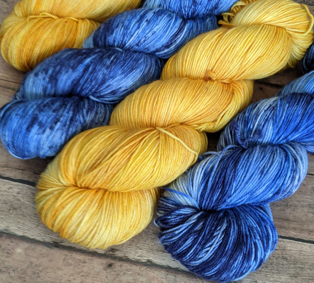
We have paired Belle of the Ball and Transponster together since we took one yarn from the warm side of the wheel and one from the cool side. You can also pick two yarns from the warm side we love Belle of the Ball with Themyscira. If you pick out two yarns from the cool side we love Sugarplum Sweetshop with Transponster.
Color Harmony
Color harmony seems like it would be so much more complicated than it actually is, but really it is just something pleasing to the eye. So when we pair yarns that look pretty together that is colors that are harmonizing together.
Boring or Chaotic?
The human brain is incredible but it also needs balance and organization. If something is visually dull the viewer will not find the color choices visibly appealing. On the opposite end of the spectrum if something is visually chaotic the human brain has a difficult time organizing it all. Take for example the two options of yarns. We have grey tonals with the pop being a gorgeous gold and below that we have a variety of neons in pinks and greens with some orange thrown in for good measure. Now which of these groupings of yarns would you pick?

If you answered the tonal greys with pop of gold that is because that is far more appealing to the eye. The variety of neons grouping is not cohesive and there is so much going on they are all fighting for the spotlight.
That is why when we are picking multiple skeins for a shawl we often want to have one yarn that pops or contrasts well with the others.
My favorite combinations of yarns are neutral tonals and pairing with a neon pop. * FUN TIP 1: Pairing neutral tonals with a neon pop mutes that neon a bit but also adds some fun to the project and adds interest to the finished product.
Color Context
How we use colors together will greatly effect how they play off each other. If you pair ones that are too similar none will stand out.
- We want to use Color to enhance.
- We want to use color to help show structure.
- We want to use color to communicate mood.

Take our Oyster Shawl we picked Riddle Me This(orange tonal) for the lace and oyster part and chose to use a retired speckled yarn as the complimentary yarn. This yarn had some of the same orange and they made a gorgeous shawl. We picked the yarns this way since a speckled yarn would compete with lace but a tonal helps highlight. You can see the yarnovers get lost with the speckled yarn in the shawl, but since it isn't the main event that is okay.
Your goal should you choose to accept it is to play around with your stash and see if you can find some beautiful combinations hiding, and if you don't find any maybe look for a starter yarn and take a look around our shop for the perfect match!
Happy Yarning!

